This is a collection of select moments from my design process—ranging from interface mockups and user flows to visual identities and brand explorations.
Weather App UI Design
A 3-day UI/UX design sprint focused on enhancing clarity and speed of visual communication.

Competitive Analysis


Design Goal
How might we offer an Effortless Habitual Experience for user?
UI Asset

Screen Pages
Task 1 - Check weather in the next few hours

Task 2 - Check the weather in another city before travel


Task 3 - Check air quality and wind speed before go outdoor

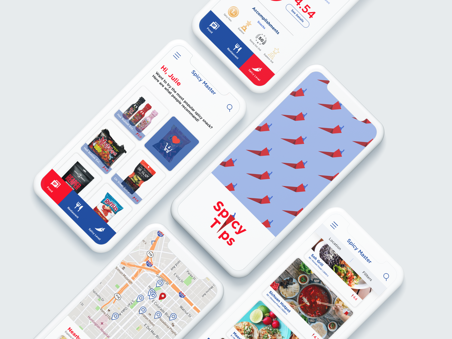
Food Butler
Systematic UIUX + Architecture Wireframe


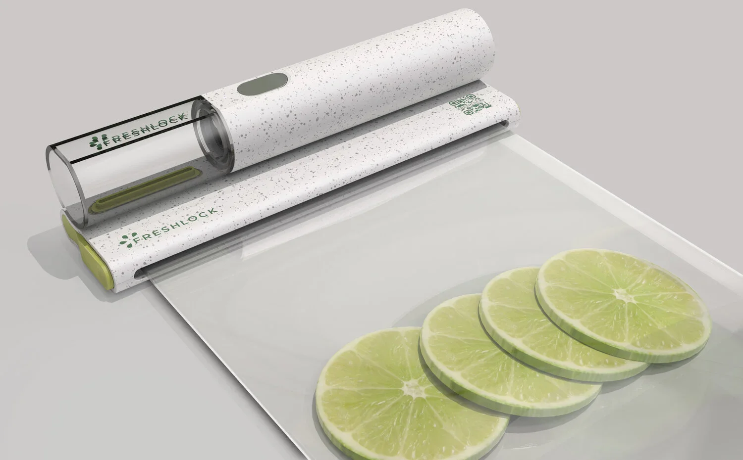
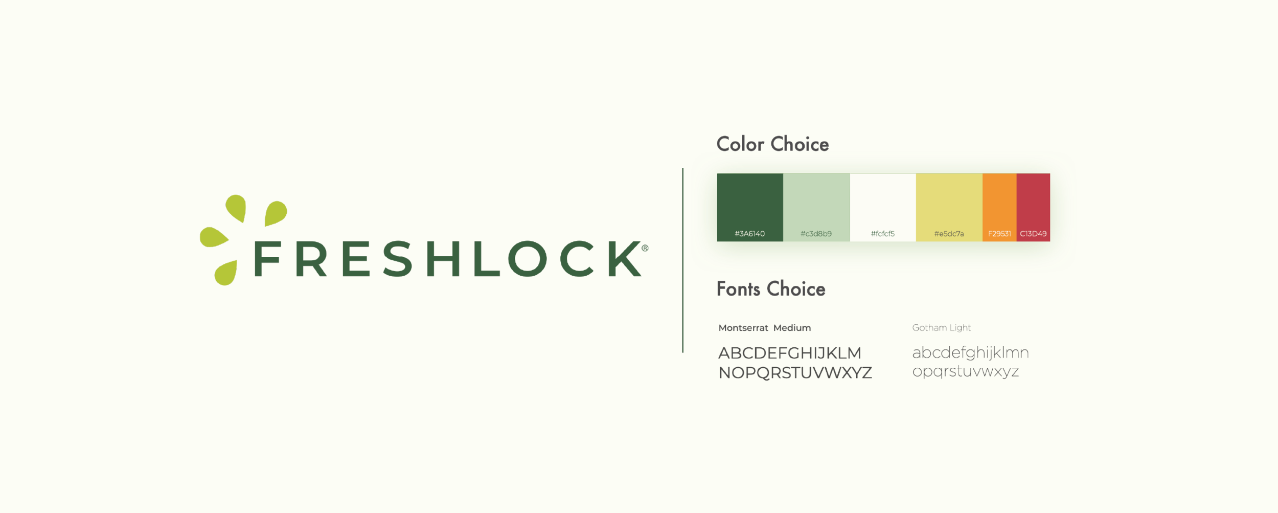
FreshLock Branding
A logo and branding system designed for a food preservation brand targeting 30+ consumers who value sustainability and fresh eating.
Moodboard Options
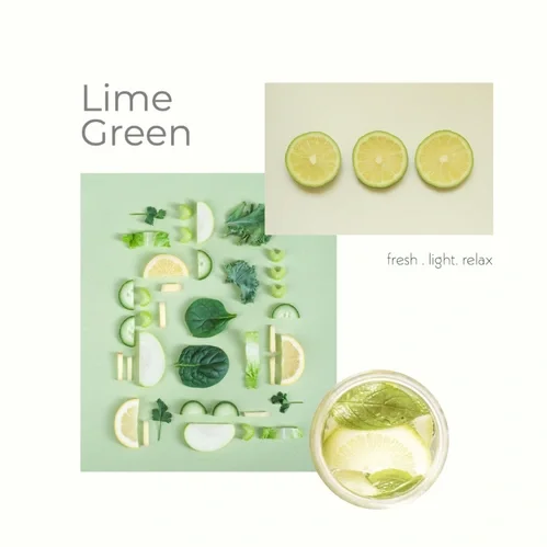
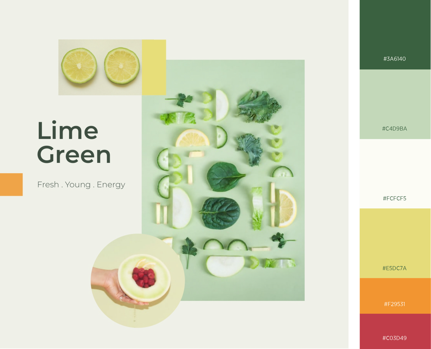
1 - Compare to the traditional shades, lime green hue is brighter and fresher. Combine with light grey, the ton gives a harmless, fresh, bright and quiet feeling.
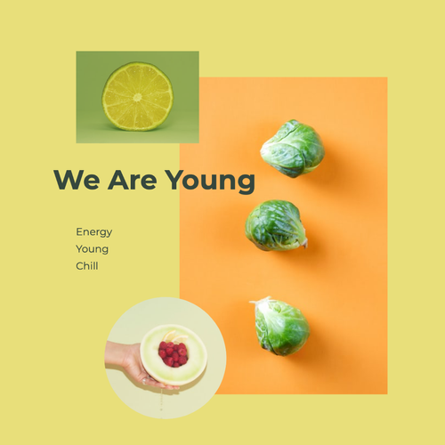
2 - Blending green into a brighter and bolder orange ton gives a stronger feeling go energy, young and optimism.
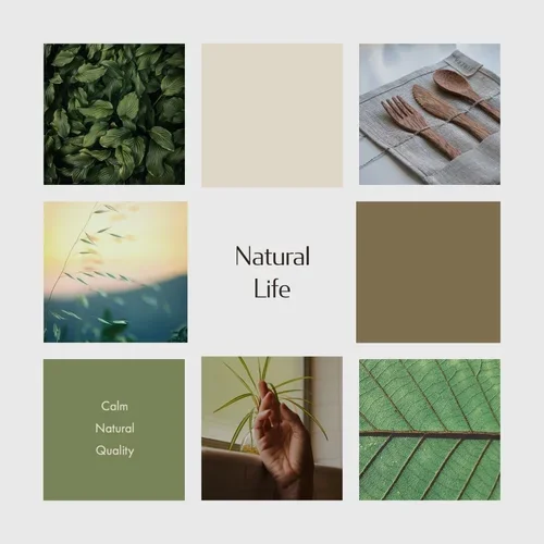
3 - Multiple shades of green combine with brownish color. It provides a feeling of natural, calm, slow and high quality of the life style.
Final Choice
Design for the younger generation, we blend the freshness from moodboard 1 and the brightness from moodboard 2.
The hint of yellow in the shades of green adds a fun, youthful spin.
The bright orange and raspberry red can be used as ornament on branding and serve to category food.
Logo Development
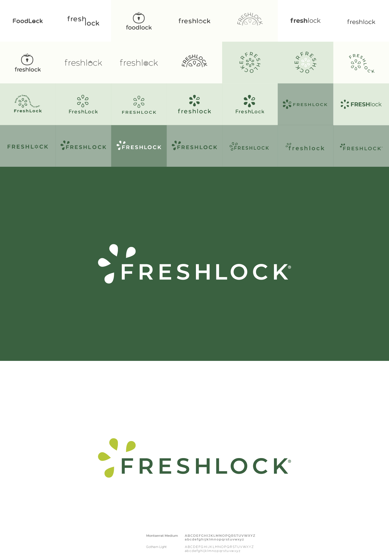
Geometric sans-serif typeface Montserrat has a nice large x-height, which gives it a lot more character and youthful feeling on top of the fluid readability. The semibold uppercase adds confidence to the brand name. The four water-drop-shape in a circle represent the four products in the system. The looks of the orange section or the splash of juice remind the luscious sourness and freshness.
Branding on Product